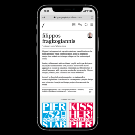
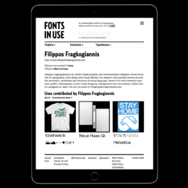
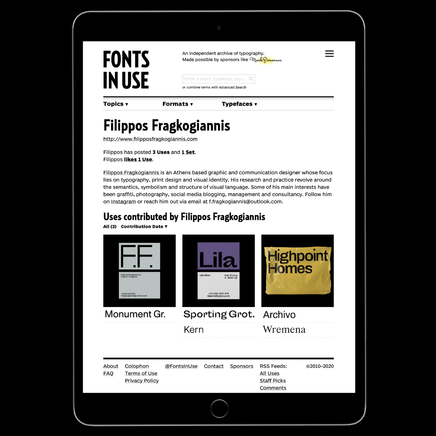
It is an honor for me to be among the 150 finalists exhibiting their work at the Posterists in the World 2022 international poster exhibition. An exhibition organized by the Peruvian Design Association and held at the iconic Machu Picchu Museum: Casa Concha in Cusco, Peru, the ancient and mysterious capital of the Inca Empire.
Karlsbader Grotesk is a sans-serif typeface designed by Christian Gruber, a German graphic and type designer based in Southern Germany. It was inspired by the Swiss/International style, everyone knows and uses, with its focus on modern and clean shapes with much attention to detail.
Excited to be a part of W Type Foundry’s “Best Wishes Italics” collaborative typography workshop, where I contributed the letters “I” and “Æ”. The workshop was conducted in January 2022, and it was the latest addition completing the world’s largest experimental collaborative typeface.
In December 2021, Fresh Fonts curator Noemi Stauffer invited me to guest curate her monthly Newsletter 81. This monthly issue does not only include great new releases such as Neptun by La Bolde Vita designed by Fabian Dornhecker, which is available to all Fresh Fonts subscribers with a commercial license, and Didot Modern by Nouvelle Noire designed by Arnaud Chemin, but it also contains my picks for the Fresh Releases section, Publish Gothic by Playtype, designer of which is Jonas Hecksher, Osbourne by Latinotype, A2Z Faucet by Daniel Schriër, Bartok by 205TF designed by Sarah Kremer and Ephidona by Bagerich Type.
Recently, Color in Architecture published an extended article about our latest collaboration with Georgia Harizani regarding the design of The Case for Color, a portable color swatch box by the Greek branch of AkzoNobel Powder Coatings.
The Case for Color launched in 2021 and is still in circulation in 2022. The Case consists of a portable box that includes powder color samples, their specifications, and the variable ways to handle a color in order to convey knowledge and accommodate the needs of Interpon Powder Coatings Greece’s clients; architects, engineers and project managers in the local market.
The Case includes 60 super durable powder-coated color samples that can be applied on aluminium and steel surfaces. Each of them is followed by detailed information about the Interpon D2525 technology behind them, along with the specifications of the colors, such as shade, texture and gloss. In a very conveniently designed case, the metallic color samples are removable for closer, effortless observation.
Read more about The Case for Color at the C/nA website. ↗
This past year, we witnessed an unprecedented, unsettling yet enlightening period unravelling before our eyes that significantly changed the world as we know it.
Through restrictions and prohibitions, and with an imperative shift in the use of technology, this new era has its own characteristics and limits, imposing certain behaviours and excluding others. The future of work however, will not be the same for everyone.
The arts, the economy and press freedom have been severely impacted. Freedom of speech and certain views were oppressed and as a consequence, a rigid and indisputable perception of how we should behave, prevailed.
I'm glad to have contributed to the creation of the new collaborative font of W Type Foundry.
This unconventional font is the result of the Collaborative Typography Workshop organized by W Type Foundry within the framework of TypeThursday BCN's May 2021 event.
Designed by 90 participants from different parts of the world, it’s an experimental, single weight, highly display typeface, ideal for short texts or headlines.
My recently updated portfolio website received an Honorable Mention and a Mobile Excellence Badge on Awwwards, the awards that recognize the talent and effort of the best web designers, developers and agencies in the world. Thanks to everyone who shared their feedback and took the time to vote!
Nice to have our latest project with Georgia Harizani for AkzoNobel Powder Coatings SA featured in both the Graphic Design and AIGA Member Galleries on Behance, presenting their color of the year Brave Ground.
Grateful to all those involved for the excellent collaboration: Sotiria Liakata, Stefanos Tsakiris, Perrakis Papers and Macart.
I'm glad to have contributed to the creation of the new collaborative font of W Type Foundry.
This unconventional font is the result of the Collaborative Typography Workshop organized by W Type Foundry within the framework of TypeThursday BCN's May 2021 event.
Designed by 90 participants from different parts of the world, it’s an experimental, single weight, highly display typeface, ideal for short texts or headlines.
Excited to see our 2021 Weekly Index with Georgia Harizani featured in both the Graphic Design and AIGA Member Galleries on Behance.
Its use is defined by a temporal system prioritizing weeks rather than days or months in the year.
Assisting navigation by clearly indexing the 52 consecutive weeks on the top right of each spread, it encourages organizing notes and ideas in a short-term framework of a well-structured routine.
Thank you to our associates Stefanos Tsakiris, Perrakis Papers and Macart for their invaluable contribution.
TYPEONE is a new bi-annual gloss magazine by the creators of FEMME TYPE that fuses type mediums with mainstream topics such as culture, business, technology, innovation, global issues and more.
All of these creative explorations headed by the Type01 team and network of freelancers discuss global-led initiatives, projects, campaigns and the people behind them – spotlighting the next generation and featuring an inclusive scope of creative humans from all over the world.
The debut issue centres around type design fused with the important global issues that 2020 has served up this year, exploring how type and design as a whole have played their part in communicating messages, amplifying voices and aiming to change the world we live in.
The magazine was designed by Alice Sherwin and Harry Bennett and published by People of Print.
Source: The Library Project
Created in 2008, Typo/Graphic Posters is a platform for inspiration and promotion of good design through the poster culture.
It focus exclusively on typographical and graphical posters, those that challenge type, colors and shapes to express a message. Each poster is reviewed to meet a standard in visual qualities and functional efforts.
Typo/Graphic Posters is developed and curated by André Felipe and Flávia Menezes of Addd Studio.
Brave Ground has been unveiled as AkzoNobel’s Color of the Year for 2021. It is a warm and grounding neutral shade that gives us the courage to embrace change.
As unprecedented events and experiences become commonplace, it is no wonder that people are feeling more off-kilter with the modern world.
According to Interpon’s extensive global trend research, what people need most right now is to feel the ground beneath their feet.
When we can take comfort in the stability of simple things, we are emboldened to express ourselves, stand up for what we believe and make new connections from the past to the future.
Glad to be a part of the Heart Directors Club’s Art Creates Water — The Magazine, featuring 40 artworks by 40 international artists for clean drinking water. Water is a human right and should be available for free around the globe.
The Heart Directors Club is a project that was called into life by Nikolai Dobreff to raise money for NGOs and foundations that fight for equal rights, anti-racism, youth welfare, reforestation, and more!
I am delighted to have won a Special Kudos award from CSS Design Awards for my website.
CSSDA's Special Kudos is a special commendation for noteworthy websites and exemplary work that deserves recognition.
My portfolio website has also been voted by the public to receive the Best UI Design, UX Design and Innovation awards.
A massive thank you to Type01 for the reflective article on my work.
I’m beyond grateful to Amber Weaver and Zoë Loring Murphy for their beautiful editing.
Read the article on Type01 ↗
Warmest thanks to People of Print for including our 2021 Weekly Index with Georgia Harizani in their Member Showcase.
Ello recently featured some of our latest work with Georgia Harizani in their editorial homepage. Ello is one of the most creative, diverse communities. Many thanks!
Design Calendar’s Digital Art Market is open today and my design is included. Every Sunday, discover new designers, buy digital designs and support Global Fund for Children!
Each month Design Calendar will choose a different theme and charity to support.
Our 365+1 Calendar with Georgia Harizani got featured on Behance’s InDesign and Graphic Design Gallery. The calendar features 1 layout system, using 1 font, in 1 colour, printed on 1 type of paper.
It can be used as a notebook, agenda, sketchbook etc. Intentionally not predisposed towards a perspective but allowing the user to create his own it represents shaping one’s New Year and the 365+1 days that follow.
Excited to have been invited to participate in the All Stars x Supernovae poster exhibition which Novi Sad 2021 - European Capital of Culture and the Kaleidoskop Design Pavilion organised with PDP Conference in Novi Sad, Serbia.
PDP 2020 will start on October 16 at the Kulturni Centar LAB, together with the program of online discussions with artists that will be streamed on their website.
Today I received Mane Tatoulian’s Year Database for 2021. With her exceptional A5 year database, users can systematize and store their projects and goals while effectively tracking progress.
It’s also ideal for collecting ideas or notes. Make sure to get yours and also read her inspiring journal containing insightful texts on contemporary culture and humanistic issues.
My work got featured as Trending in Design on Ello's editorial homepage.
Gradient Type Foundry provides a set of unique retail typefaces with well-polished details and a strong personality.
Achieving an impact on most scales, Milos Mitrovic’s letters are well-thought-out and blend harmoniously with each other.
Undoubtedly, Linear Sans and Radial can be useful assets for any contemporary designer.
Being a keen supporter of the exchange of ideas and information amongst design professionals, I have recently been listed as a member in the American Institute of Graphic Arts.
AIGA, the professional association for design, is the oldest and largest not-for-profit design organization in the United States of America.
AIGA is committed to advancing the value and impact of design, laying foundations for the participation in critical analysis, research and the advancement of education and ethical practice.
Special thanks to the one and only Elliot Ulm for these beautiful iPhone cases, his latest collaboration with Casetify. Elliot is one of the smartest, talented creatives out there.
With great wit and natural confidence, he manages to add a unique perspective to the design community and design itself. I wish him the best for the future, that’s definitely looking bright.
Many thanks to The Designers Foundry and Daniel McQueen for sending me their 8th-anniversary air freshener as a gift. Nice type and elegant object, designed by David Einwaller!
“First We Shape The Tools, Then They Shape Us”. TDF is a hand-picked international team of type designers who strive to provide all designers with a quality resource of curated typefaces that is constantly evolving.
In its article "Wallpaper*Poster Campaign: 50 of the finest", Wallpaper* presents a selection of 50 out of a 1000 poster entries, including my own, that reflect on the Covid 19 crisis.
More than 1000 readers, from across the global creative community, responded to their call for graphic innovation to reflect on the Covid 19 crisis and spread messages of hope. The full digital response can be found on Instagram.
Type 01 featured 15 type-focused artists and agencies, selected by Certain Magazine: Semiotik Design Agency, Kris Andrew Small, Ira Arturawna, Sebastian Pren, G Design Studio, Gregory Page, Ryan Carl, MNP Athens, Koln Studio, Emilie Vizcano, HOLT, pfp, disseny, Tim Lindacher, Quatrième Étage and Tres Tipos Gráficos.
Design Calendar is putting on an online design auction to raise money to help people most vulnerable to the virus. Everything raised will be donated to the International Committee of the Red Cross and their efforts to help those most in need.
BBDB Studio organized a remote Concrete Poetry Workshop to bring a personal perspective in these times of uncertainty. Fifteen amazing creatives joined them in this effort.
Today, with the outcomes of their work they are launching a fundraising campaign for the World Health Organization (WHO) COVID 19 Solidarity Response Fund. They will donate all the money they can raise.
It's Nice That featured my Stay Home poster in its article "Creatives band together for support during the crisis".
It's Nice That featured a selection of reactions, from the creative industry, to the current crisis. Including messages of support, fundraisers helping those affected as well as projects to work on from home.
Facing an indeterminate period of self-isolation and an altogether worrisome and unprecedented state of affairs, the creative community has done what it always does: band together and think of brilliant ways to weather the storm".
The Fonts In Use are Gatwick by Pangram Pangram Foundry and Valerio Monopoli, Microsoft Webdings, Neue Haas Grotesk by Monotype, Typefesse Pleine by Velvetyne and Océane Juvin and Helvetica.
My poster was selected among the top three of the Poster Jam challenge of May 2018 and exhibited together with a selection of other entries, in a group exhibition organised by Poster Jam & Hot Lagoon at Cazul 101, Bucharest.
It is an honor for me to be among the 150 finalists exhibiting their work at the Posterists in the World 2022 international poster exhibition. An exhibition organized by the Peruvian Design Association and held at the iconic Machu Picchu Museum: Casa Concha in Cusco, Peru, the ancient and mysterious capital of the Inca Empire.
Karlsbader Grotesk is a sans-serif typeface designed by Christian Gruber, a German graphic and type designer based in Southern Germany. It was inspired by the Swiss/International style, everyone knows and uses, with its focus on modern and clean shapes with much attention to detail.
Excited to be a part of W Type Foundry’s “Best Wishes Italics” collaborative typography workshop, where I contributed the letters “I” and “Æ”. The workshop was conducted in January 2022, and it was the latest addition completing the world’s largest experimental collaborative typeface.
In December 2021, Fresh Fonts curator Noemi Stauffer invited me to guest curate her monthly Newsletter 81. This monthly issue does not only include great new releases such as Neptun by La Bolde Vita designed by Fabian Dornhecker, which is available to all Fresh Fonts subscribers with a commercial license, and Didot Modern by Nouvelle Noire designed by Arnaud Chemin, but it also contains my picks for the Fresh Releases section, Publish Gothic by Playtype, designer of which is Jonas Hecksher, Osbourne by Latinotype, A2Z Faucet by Daniel Schriër, Bartok by 205TF designed by Sarah Kremer and Ephidona by Bagerich Type.
Recently, Color in Architecture published an extended article about our latest collaboration with Georgia Harizani regarding the design of The Case for Color, a portable color swatch box by the Greek branch of AkzoNobel Powder Coatings.
The Case for Color launched in 2021 and is still in circulation in 2022. The Case consists of a portable box that includes powder color samples, their specifications, and the variable ways to handle a color in order to convey knowledge and accommodate the needs of Interpon Powder Coatings Greece’s clients; architects, engineers and project managers in the local market.
The Case includes 60 super durable powder-coated color samples that can be applied on aluminium and steel surfaces. Each of them is followed by detailed information about the Interpon D2525 technology behind them, along with the specifications of the colors, such as shade, texture and gloss. In a very conveniently designed case, the metallic color samples are removable for closer, effortless observation.
Read more about The Case for Color at the C/nA website. ↗
This past year, we witnessed an unprecedented, unsettling yet enlightening period unravelling before our eyes that significantly changed the world as we know it.
Through restrictions and prohibitions, and with an imperative shift in the use of technology, this new era has its own characteristics and limits, imposing certain behaviours and excluding others. The future of work however, will not be the same for everyone.
The arts, the economy and press freedom have been severely impacted. Freedom of speech and certain views were oppressed and as a consequence, a rigid and indisputable perception of how we should behave, prevailed.
I'm glad to have contributed to the creation of the new collaborative font of W Type Foundry.
This unconventional font is the result of the Collaborative Typography Workshop organized by W Type Foundry within the framework of TypeThursday BCN's May 2021 event.
Designed by 90 participants from different parts of the world, it’s an experimental, single weight, highly display typeface, ideal for short texts or headlines.
My recently updated portfolio website received an Honorable Mention and a Mobile Excellence Badge on Awwwards, the awards that recognize the talent and effort of the best web designers, developers and agencies in the world. Thanks to everyone who shared their feedback and took the time to vote!
Nice to have our latest project with Georgia Harizani for AkzoNobel Powder Coatings SA featured in both the Graphic Design and AIGA Member Galleries on Behance, presenting their color of the year Brave Ground.
Grateful to all those involved for the excellent collaboration: Sotiria Liakata, Stefanos Tsakiris, Perrakis Papers and Macart.
Excited to be part of the largest free downloadable collaborative typeface ever made, designed collaboratively by 83 participants in different parts of the world! It is an experimental typeface, highly display, for short texts or headlines.
In an increasingly virtual world, W Type Foundry decided to move away from the digital approach to fonts and rethink their usual collaborative workshop, bringing it to an analog format.
The principles are the same, creating letters using shapes within a grid, but this time manually, with tools; scissors, paper and glue.
The Collaborative Typography Workshop takes place within the New Latin Wave Arts Festival 2021.
Excited to see our 2021 Weekly Index with Georgia Harizani featured in both the Graphic Design and AIGA Member Galleries on Behance.
Its use is defined by a temporal system prioritizing weeks rather than days or months in the year.
Assisting navigation by clearly indexing the 52 consecutive weeks on the top right of each spread, it encourages organizing notes and ideas in a short-term framework of a well-structured routine.
Thank you to our associates Stefanos Tsakiris, Perrakis Papers and Macart for their invaluable contribution.
TYPEONE is a new bi-annual gloss magazine by the creators of FEMME TYPE that fuses type mediums with mainstream topics such as culture, business, technology, innovation, global issues and more.
All of these creative explorations headed by the Type01 team and network of freelancers discuss global-led initiatives, projects, campaigns and the people behind them – spotlighting the next generation and featuring an inclusive scope of creative humans from all over the world.
The debut issue centres around type design fused with the important global issues that 2020 has served up this year, exploring how type and design as a whole have played their part in communicating messages, amplifying voices and aiming to change the world we live in.
The magazine was designed by Alice Sherwin and Harry Bennett and published by People of Print.
Source: The Library Project
Created in 2008, Typo/Graphic Posters is a platform for inspiration and promotion of good design through the poster culture.
It focus exclusively on typographical and graphical posters, those that challenge type, colors and shapes to express a message. Each poster is reviewed to meet a standard in visual qualities and functional efforts.
Typo/Graphic Posters is developed and curated by André Felipe and Flávia Menezes of Addd Studio.
Brave Ground has been unveiled as AkzoNobel’s Color of the Year for 2021. It is a warm and grounding neutral shade that gives us the courage to embrace change.
As unprecedented events and experiences become commonplace, it is no wonder that people are feeling more off-kilter with the modern world.
According to Interpon’s extensive global trend research, what people need most right now is to feel the ground beneath their feet.
When we can take comfort in the stability of simple things, we are emboldened to express ourselves, stand up for what we believe and make new connections from the past to the future.
Glad to be a part of the Heart Directors Club’s Art Creates Water — The Magazine, featuring 40 artworks by 40 international artists for clean drinking water. Water is a human right and should be available for free around the globe.
The Heart Directors Club is a project that was called into life by Nikolai Dobreff to raise money for NGOs and foundations that fight for equal rights, anti-racism, youth welfare, reforestation, and more!
I am delighted to have won a Special Kudos award from CSS Design Awards for my website.
CSSDA's Special Kudos is a special commendation for noteworthy websites and exemplary work that deserves recognition.
My portfolio website has also been voted by the public to receive the Best UI Design, UX Design and Innovation awards.
A massive thank you to Type01 for the reflective article on my work.
I’m beyond grateful to Amber Weaver and Zoë Loring Murphy for their beautiful editing.
Read the article on Type01 ↗
Warmest thanks to People of Print for including our 2021 Weekly Index with Georgia Harizani in their Member Showcase.
Ello recently featured some of our latest work with Georgia Harizani in their editorial homepage. Ello is one of the most creative, diverse communities. Many thanks!
Design Calendar’s Digital Art Market is open today and my design is included. Every Sunday, discover new designers, buy digital designs and support Global Fund for Children!
Each month Design Calendar will choose a different theme and charity to support.
Our 365+1 Calendar with Georgia Harizani got featured on Behance’s InDesign and Graphic Design Gallery. The calendar features 1 layout system, using 1 font, in 1 colour, printed on 1 type of paper.
It can be used as a notebook, agenda, sketchbook etc. Intentionally not predisposed towards a perspective but allowing the user to create his own it represents shaping one’s New Year and the 365+1 days that follow.
Excited to have been invited to participate in the All Stars x Supernovae poster exhibition which Novi Sad 2021 - European Capital of Culture and the Kaleidoskop Design Pavilion organised with PDP Conference in Novi Sad, Serbia.
PDP 2020 will start on October 16 at the Kulturni Centar LAB, together with the program of online discussions with artists that will be streamed on their website.
Today I received Mane Tatoulian’s Year Database for 2021. With her exceptional A5 year database, users can systematize and store their projects and goals while effectively tracking progress.
It’s also ideal for collecting ideas or notes. Make sure to get yours and also read her inspiring journal containing insightful texts on contemporary culture and humanistic issues.
My work got featured as Trending in Design on Ello's editorial homepage.
Gradient Type Foundry provides a set of unique retail typefaces with well-polished details and a strong personality.
Achieving an impact on most scales, Milos Mitrovic’s letters are well-thought-out and blend harmoniously with each other.
Undoubtedly, Linear Sans and Radial can be useful assets for any contemporary designer.
Being a keen supporter of the exchange of ideas and information amongst design professionals, I have recently been listed as a member in the American Institute of Graphic Arts.
AIGA, the professional association for design, is the oldest and largest not-for-profit design organization in the United States of America.
AIGA is committed to advancing the value and impact of design, laying foundations for the participation in critical analysis, research and the advancement of education and ethical practice.
Special thanks to the one and only Elliot Ulm for these beautiful iPhone cases, his latest collaboration with Casetify. Elliot is one of the smartest, talented creatives out there.
With great wit and natural confidence, he manages to add a unique perspective to the design community and design itself. I wish him the best for the future, that’s definitely looking bright.
Many thanks to The Designers Foundry and Daniel McQueen for sending me their 8th-anniversary air freshener as a gift. Nice type and elegant object, designed by David Einwaller!
“First We Shape The Tools, Then They Shape Us”. TDF is a hand-picked international team of type designers who strive to provide all designers with a quality resource of curated typefaces that is constantly evolving.
In its article "Wallpaper*Poster Campaign: 50 of the finest", Wallpaper* presents a selection of 50 out of a 1000 poster entries, including my own, that reflect on the Covid 19 crisis.
More than 1000 readers, from across the global creative community, responded to their call for graphic innovation to reflect on the Covid 19 crisis and spread messages of hope. The full digital response can be found on Instagram.
Type 01 featured 15 type-focused artists and agencies, selected by Certain Magazine: Semiotik Design Agency, Kris Andrew Small, Ira Arturawna, Sebastian Pren, G Design Studio, Gregory Page, Ryan Carl, MNP Athens, Koln Studio, Emilie Vizcano, HOLT, pfp, disseny, Tim Lindacher, Quatrième Étage and Tres Tipos Gráficos.
Design Calendar is putting on an online design auction to raise money to help people most vulnerable to the virus. Everything raised will be donated to the International Committee of the Red Cross and their efforts to help those most in need.
BBDB Studio organized a remote Concrete Poetry Workshop to bring a personal perspective in these times of uncertainty. Fifteen amazing creatives joined them in this effort.
Today, with the outcomes of their work they are launching a fundraising campaign for the World Health Organization (WHO) COVID 19 Solidarity Response Fund. They will donate all the money they can raise.
It's Nice That featured my Stay Home poster in its article "Creatives band together for support during the crisis".
It's Nice That featured a selection of reactions, from the creative industry, to the current crisis. Including messages of support, fundraisers helping those affected as well as projects to work on from home.
Facing an indeterminate period of self-isolation and an altogether worrisome and unprecedented state of affairs, the creative community has done what it always does: band together and think of brilliant ways to weather the storm".
The Fonts In Use are Gatwick by Pangram Pangram Foundry and Valerio Monopoli, Microsoft Webdings, Neue Haas Grotesk by Monotype, Typefesse Pleine by Velvetyne and Océane Juvin and Helvetica.
My poster was selected among the top three of the Poster Jam challenge of May 2018 and exhibited together with a selection of other entries, in a group exhibition organised by Poster Jam & Hot Lagoon at Cazul 101, Bucharest.