Greek Graphic Design Awards 2020 Jury
Pleased to have been invited to be a member of the jury for the Greek Graphic Design and Illustration Awards. Decision making brought about very interesting discussions and critical remarks.
Thank you Demetrios Fakinos and Katerina Papanagiotou for inviting me to review all these great entries and best of luck to all participating designers!
Juror's Choice Commentary
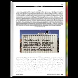
My Juror's Choice commentary on Semiotik Design’s identity for Core, recently published in this year’s Greek Graphic Design and Illustration Awards catalogue. The cover features MNP's beautifully implemented identity for the awards.
CORE
Core is a bold, self-sufficient and functional idea. Its independent personality, handling of typography and compact structure of information are just some of the highlights. At the core of visual identity is the language, an archetypal element of interpersonal communication and cultural interaction.
The logo, the individual distinctive names, as well as the spatial marking are in harmony, offering a unified reading experience in the space. As a well-structured solution, it applicates on different scales, thus distributing equally the interest and characteristics of each location in the eyes of the visitor. For instance, the labelling of a store that supplies branded products is followed by the labelling of a sports field or a cart that offers refreshing ice creams.
The austere character of the work does not deprive anything of its powerful visual impact, which directs and informs effectively, while being easily memorized. Created for one of the most popular destinations in the world, Crete, the proposal successfully responds both to the background of the infrastructure and the framework in which it is integrated, and to the public that utilizes the spaces.
At the research level, the creation of "Core" involves a complex process of classifying information, so that during the implementation, dynamic cohesive bonds emerge and the possibility of a systematic expansion of identity in the future is ensured.
This projects responds consistently to the most current demands of visual communication: the ability to address an international and often heterogeneous audience, while focusing on clarity, immediacy and unpretentious aesthetics.


Profile
Filippos Fragkogiannis is an award-winning freelance graphic designer and poster artist based in Athens, Greece. He is noted for his exploration of semiotics, language and symbols in his work, which focuses on typography.
Capabilities
His design portfolio features a range of creative outputs, including advertising, branding, logos, posters and digital design. Filippos is highly skilled in Adobe Photoshop, Illustrator and InDesign.
Online Appointments
Interested parties can collaborate with Filippos Fragkogiannis remotely from any location. He offers virtual appointments for initial consultations, providing his services exclusively online.
Process
His creative process involves thorough research and idea gathering, followed by simplification and refinement. His goal is to create impactful visual messages that resonate with diverse audiences.
Collaboration
Filippos Fragkogiannis is open to freelance work and contract assignments. He welcomes inquiries about new client projects, design consultancy, commissions, guest authoring and collaborations.
Free Consultation
Filippos is delighted to provide a complimentary online consultation to address the needs of qualified clients. Reach out via email, phone, WhatsApp, Viber, Signal, LINE, Telegram or Messenger to schedule your appointment and discuss his services.
SOLUTIONS
Visual Communication
XML Sitemap Configuration
HTML Sitemap Creation
Search Engine Optimization
Content Optimization
ALT Text for Images
WordPress Consultation
Google Business Profile
Wikipedia Page Creation
Social Media Management
Google Knowledge Graph
Schema Markup Implementation
Bing Places for Business
Link Building Strategy
Google Search Console Verification
Bing Webmaster Tools Verification
Website Speed Optimization
Meta Tag Writing
LATEST WORK
Vercetti Regular
RIMOWA Postage Stamps for Cologne
Fonts.gr Digital Content and Social Media
Warped Cigars Be Exclusively Different
Those Fears T-Shirt on Everpress
Kalogirou L' Appartement
RECENT NEWS
AI Monday Website
Awwwards Jury Member 2025
IDA Design Awards 2023 Honorable Mention
Online Design Awards Winner (Q4 2023)
Hiiibrand Awards 2022 Merit Award
Alastair Strong Website
Why Hire a Freelance Graphic Designer
THEME
BUILT WITH
HOSTED ON
DOMAIN REGISTRAR
PAYMENT METHODS
Product names on this website are for identification purposes only. All trademarks are the property of their respective owners.
All rights reserved © 2026
Last updated 13 May 2026

Profile
Filippos Fragkogiannis is an award-winning freelance graphic designer and poster artist based in Athens, Greece. He is noted for his exploration of semiotics, language and symbols in his work, which focuses on typography.
Process
His creative process involves thorough research and idea gathering, followed by simplification and refinement. His goal is to create impactful visual messages that resonate with diverse audiences.
Capabilities
His design portfolio features a range of creative outputs, including advertising, branding, logos, posters and digital design. Filippos is highly skilled in Adobe Photoshop, Illustrator and InDesign.
Collaboration
Filippos Fragkogiannis is open to freelance work and contract assignments. He welcomes inquiries about new client projects, design consultancy, commissions, guest authoring and collaborations.
Online Appointments
Interested parties can collaborate with Filippos Fragkogiannis remotely from any location. He offers virtual appointments for initial consultations, providing his services exclusively online.
Free Consultation
Filippos is delighted to provide a complimentary online consultation to address the needs of qualified clients. Reach out via email, phone, WhatsApp, Viber, Signal, LINE, Telegram, or Messenger to schedule your appointment and discuss his services.
MENU
Home
About
Contact
Services
News
Work
CV
INFO
Phone
WhatsApp
Viber
Signal
LINE
Telegram
Messenger
Email
Address
vCard
SOCIAL
Instagram
Threads
LinkedIn
Behance
Dribbble
Mastodon
Facebook
Pinterest
X (Twitter)
TikTok
Bluesky
OTHER
Linktree
Read.cv
About.me
SOLUTIONS
Visual Communication
XML Sitemap Configuration
HTML Sitemap Creation
Search Engine Optimization
Content Optimization
ALT Text for Images
WordPress Consultation
Google Business Profile
Wikipedia Page Creation
Social Media Management
Google Knowledge Graph
Schema Markup Implementation
Bing Places for Business
Link Building Strategy
Google Search Console Verification
Bing Webmaster Tools Verification
Website Speed Optimization
Meta Tag Writing
PROJECTS
Advertising
Art Direction
Branding
Digital
Editorial
Fonts
Graphic Design
Merchandise
Poster
Social Media
Typography
POSTS
Award
Blog
Fonts in Use
Exhibition
Jury Member
Interview
Publication
Workshop
RESOURCES
Feeds
Credits
Links
LEGAL
Imprint
Disclaimer
Copyright
Privacy
Terms
Cookies
Affiliate
Anti-Spam
REVIEWS
Trustpilot
Google
Sitejabber
HELP
Accessibility
Site Map
Payment Methods
Feedback
FAQ
LATEST WORK
Vercetti Regular
RIMOWA Postage Stamps for Cologne
Fonts.gr Digital Content and Social Media
Warped Cigars Be Exclusively Different
Those Fears T-Shirt on Everpress
Kalogirou L' Appartement
RECENT NEWS
AI Monday Website
Awwwards Jury Member 2025
IDA Design Awards 2023 Honorable Mention
Online Design Awards Winner (Q4 2023)
Hiiibrand Awards 2022 Merit Award
Alastair Strong Website
Why Hire a Freelance Graphic Designer
BUILT WITH
THEME
HOSTED ON
DOMAIN REGISTRAR
PAYMENT METHODS
Product names on this website are for identification purposes only. All trademarks are the property of their respective owners.


